Introduction
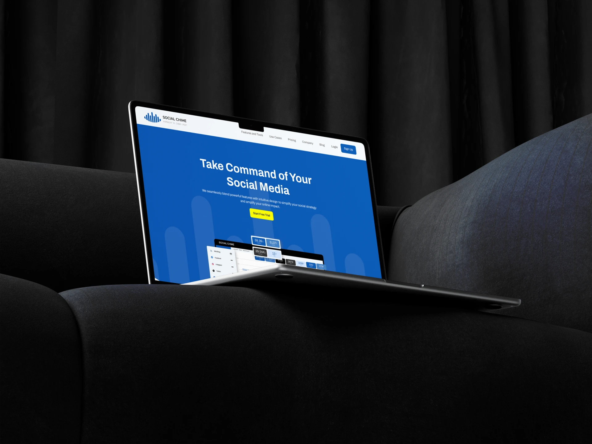
This project aimed to craft a distinct brand identity for Social Chime, a company at the forefront of digital communication. Social Chime is a social media management system that seamlessly blends powerful features with intuitive design to amplify online impact.We explored the interplay between sound, connectivity, and modern technology to create a visual narrative that speaks directly to Social Chime’s innovative spirit and commitment to facilitating seamless interactions.

Inspiration and Theme
Drawing inspiration from the harmony of a chime and the fluidity of communication, the logo was conceptualized to symbolize the seamless integration of technology and human interaction. The design process involved extensive research into sound waves and communication patterns, ensuring the logo not only represented Social Chime’s services but also resonated with its core values.

Color Palette
The color palette was carefully curated to reflect tranquility, innovation, and approachability. Deep blues signify trust and dependability, while purples represent creativity and originality. Soft pinks were included to add warmth and approachability, essential for a brand centered around human connection. These colors were chosen to appeal to a broad audience while maintaining a professional and modern aesthetic.

Typography
Typography selections were made to complement the logo’s fluidity and the brand’s modern outlook. The primary typeface, chosen for its readability and clean lines, ensures ease of communication across all platforms. The secondary typeface adds character to the brand, providing a subtle nod to the innovative nature of Social Chime.

Logo Variations and Usage
The logo’s adaptability across various media was a key consideration. We developed a range of variations, each tailored for specific applications – from digital avatars to large-scale print media. This section of the case study would delve into the specifics of each variation, including size specifications, background considerations, and color adaptations.
The branding and logo design for Social Chime successfully captures the essence of the company – innovative, approachable, and deeply connected to the modern digital landscape. This case study not only showcases the final product but also the strategic thinking and creative process behind building a cohesive and resonant brand identity.